Design Approach
Using the Double Diamond Strategy I created a problem statement, brainstormed potential solutions, then narrowed it down to a single solution I believed would solve the problem.
PROBLEM STATEMENT
Users need a way to find free expert advice, at any time, and be confident the advice is solid- getting subpar advice and inconsistent availability from experts will not solve their problems.
We will know this to be true when we see accumulating member subscriptions, high ratings, and positive reviews.
01 DISCOVER
Competitor Research & Analysis
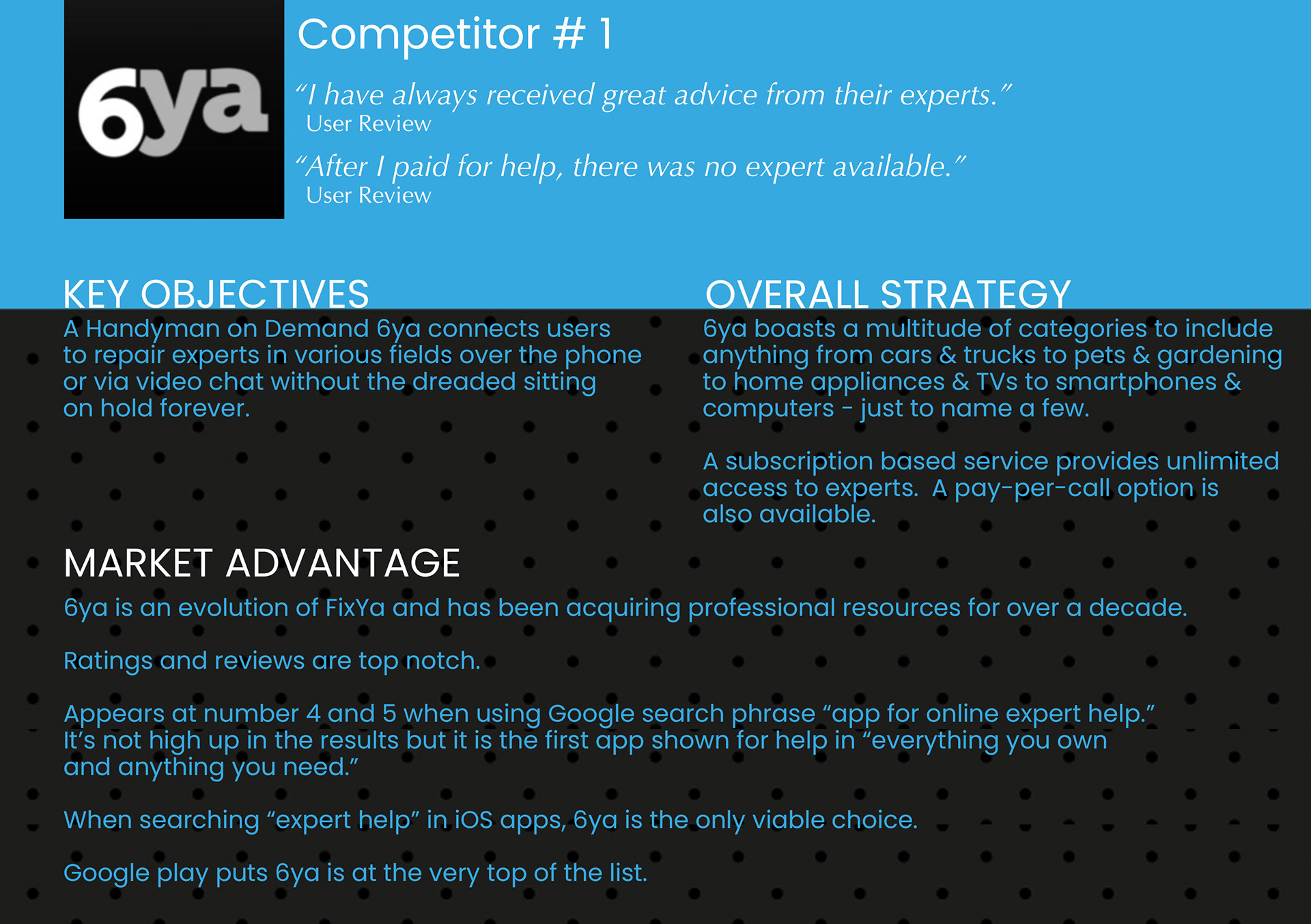
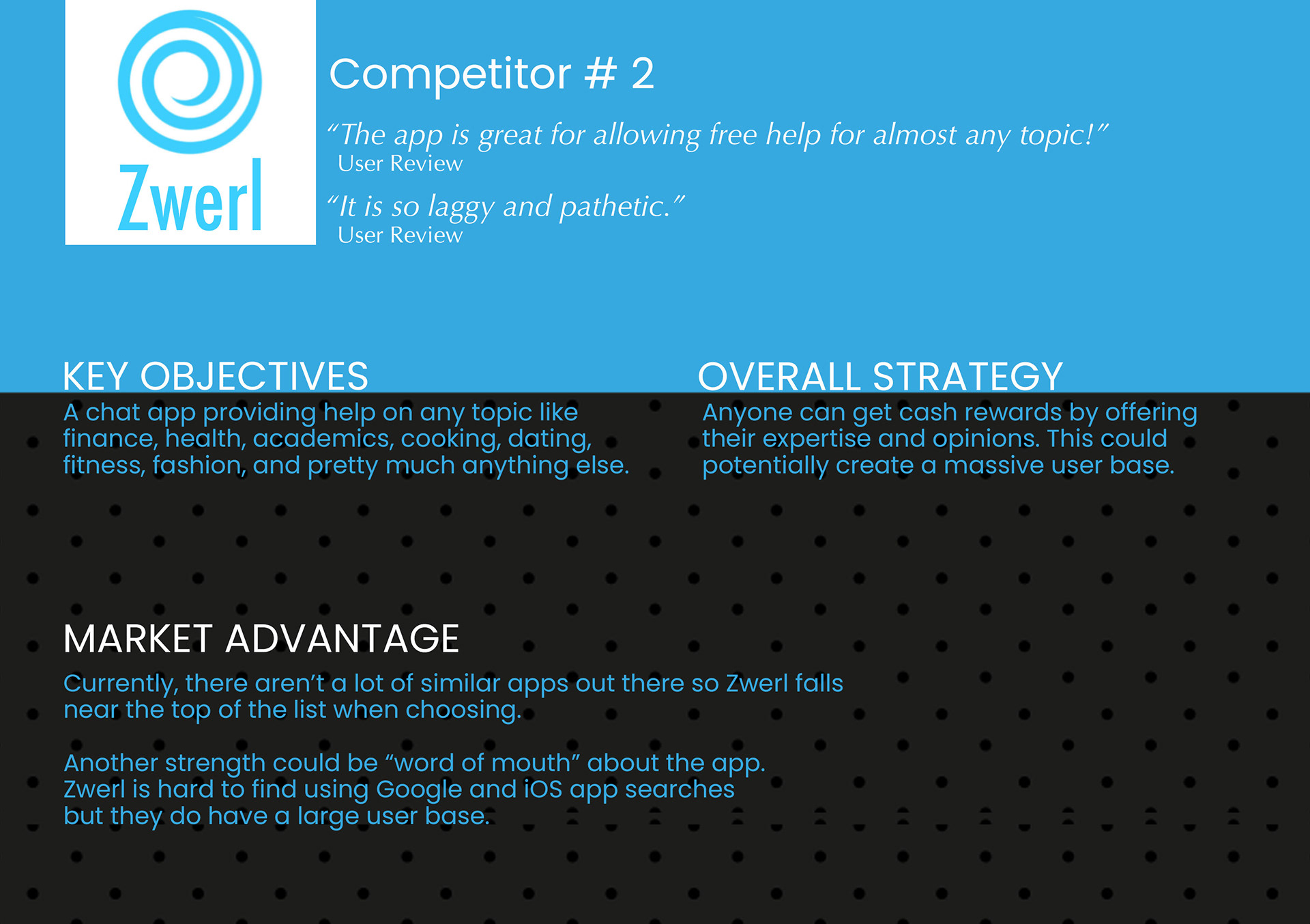
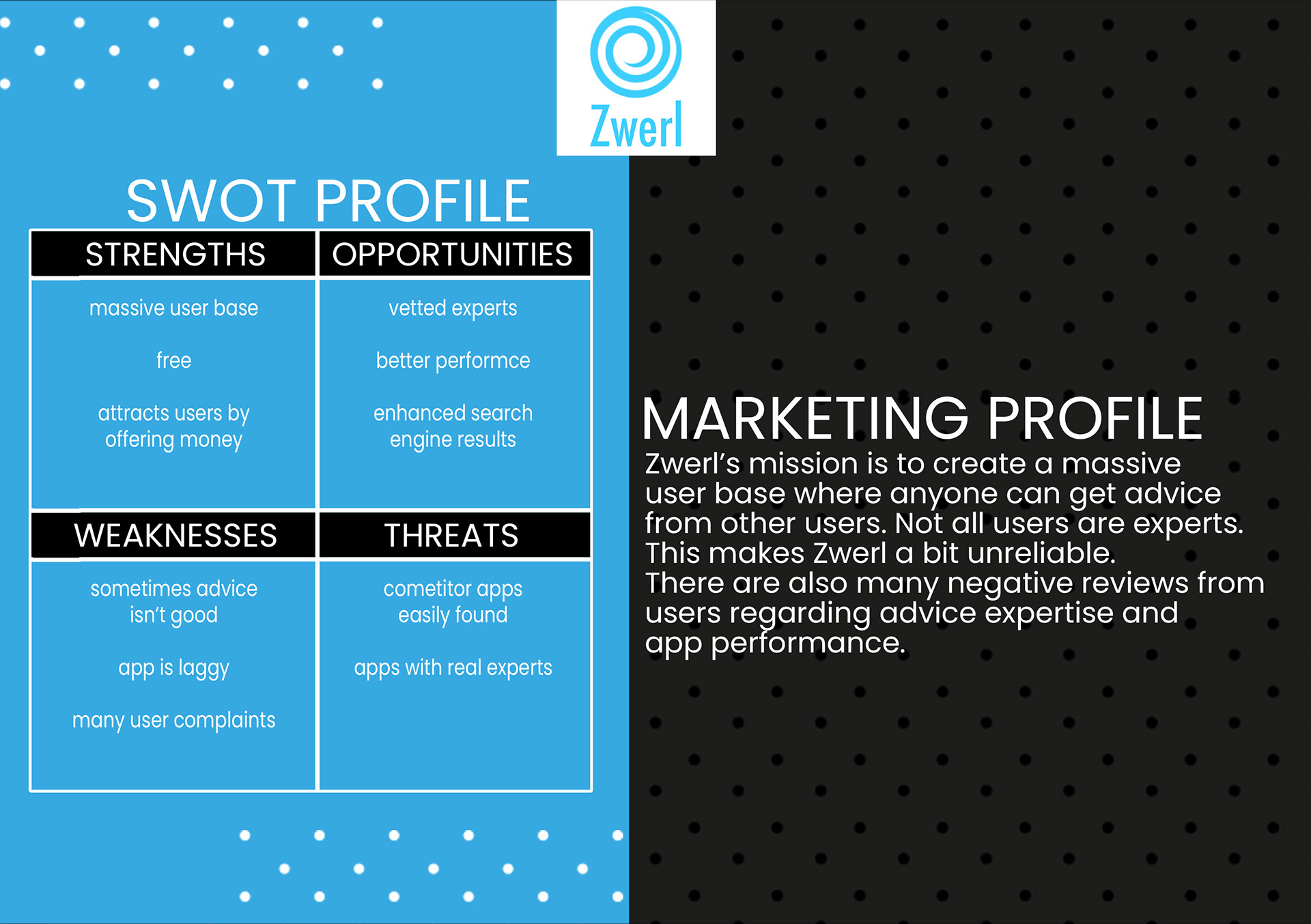
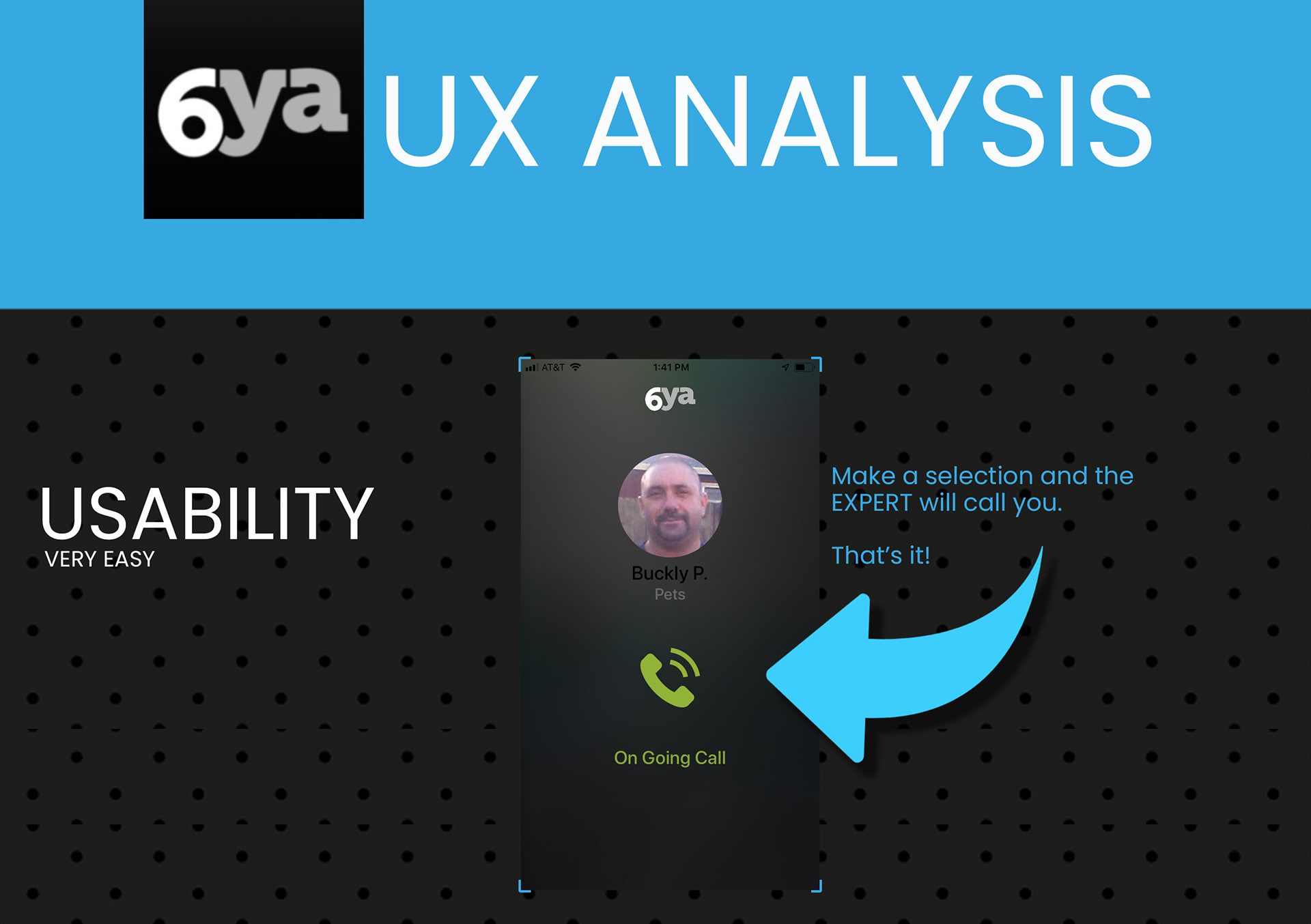
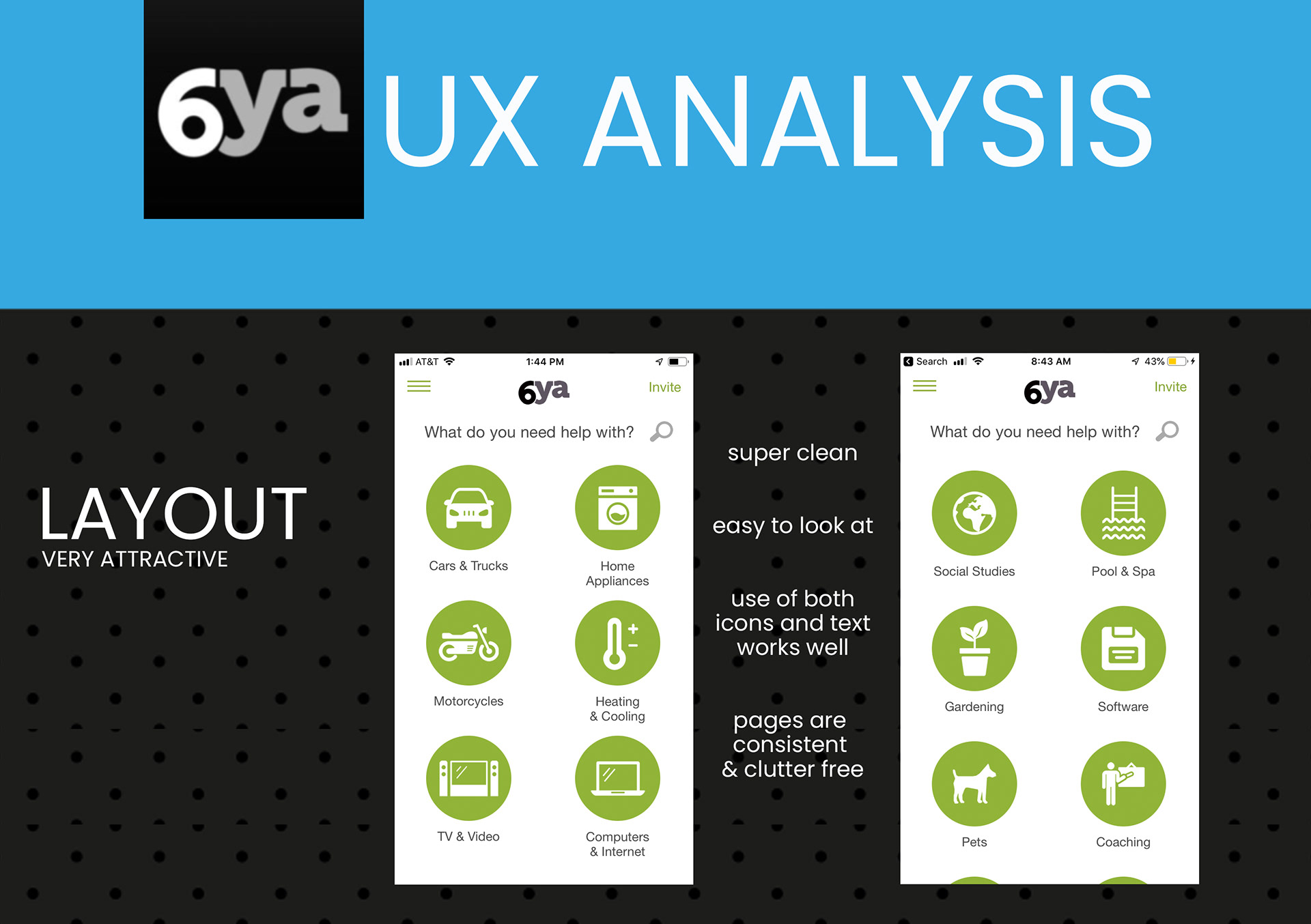
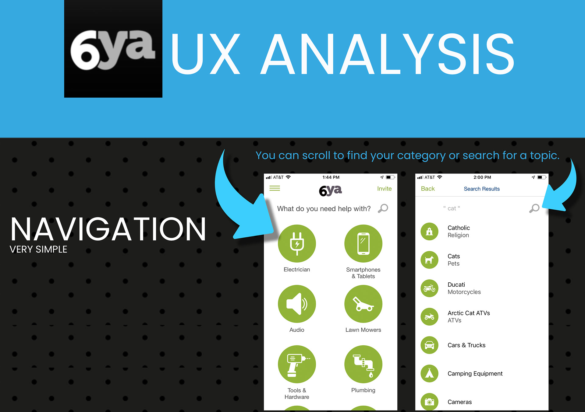
Researching competitors sheds light on what users liked and disliked about similar apps.
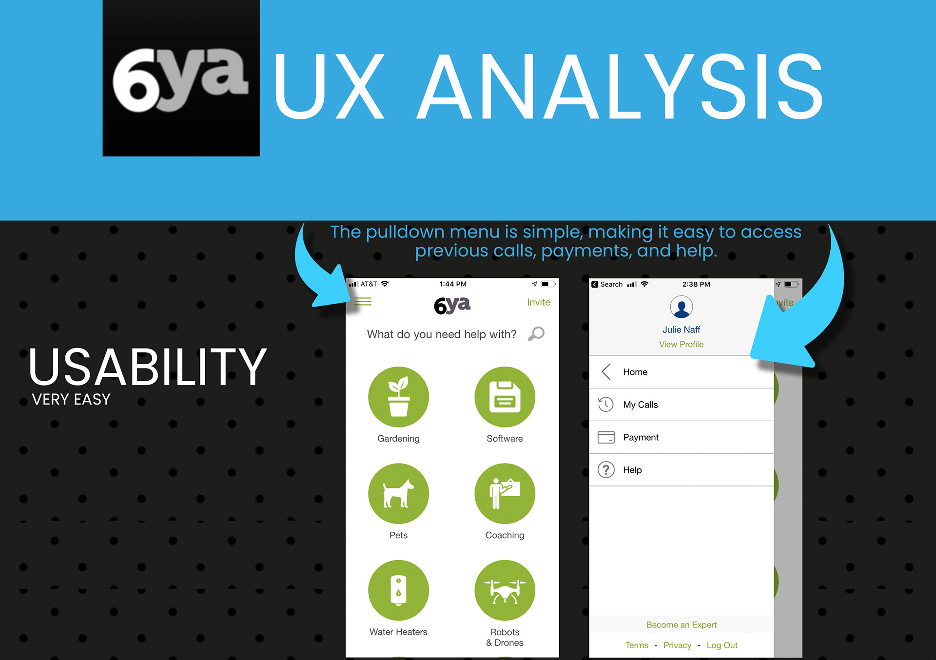
LIKED: 6ya is a great app. It's designed well and is fairly easy to use
LACKED: Apps did not provide any onboarding
LEARNED: It's going to take some time to acquire pool of professional resources
LONGED FOR: More competitor apps to research

User Research & Analysis
● Rival apps are not being used
● The web has a lot of free advice
● Information found online is not always reliable or specific enough
● Some advice is worth more than other advice
● Ratings, reviews, and listed qualifications are important
● If an EXPERT is not immediately available, options are important
● Our users need to have someone with whom they can talk through their problems
● Advice from vetted experts, documentation, ratings/reviews, scheduling options and
multiple ways to communicate with our EXPERTS will provide a valuable service to our users.
● If the EXPERT advice is solid and the expert is reliable, our users will pay good money
● If our users feel their time is productive using our app for advice, they will use the app again, give the app a high rating, and tell their friends
02 DEFINE
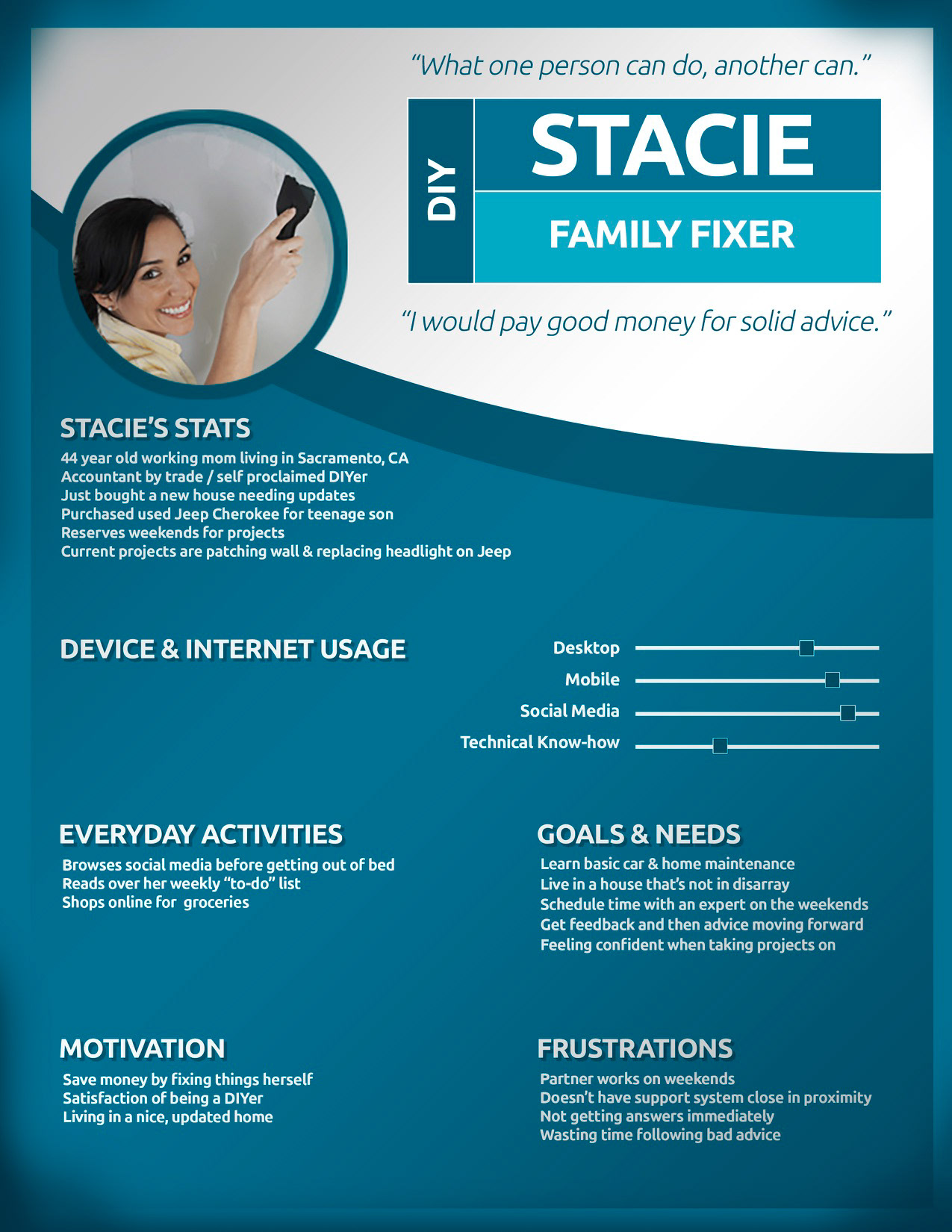
User Personas
Based on the user research analysis, user personas were created to represent different user types for the EXPERT app.

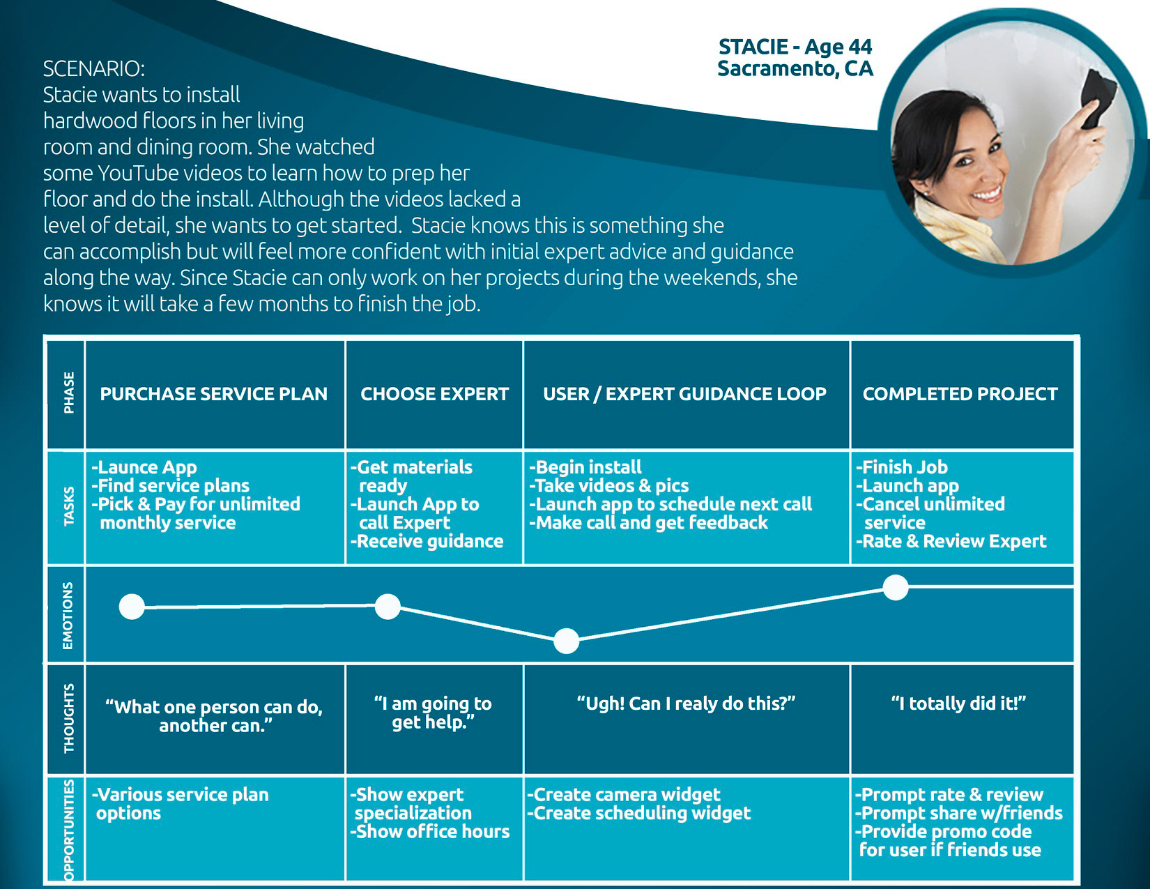
Mental Models & User Journeys
This was key in seeing how particular users might use the EXPERT app to solve their problems and how they may feel during the experience.

Task Analysis & User Flows
Visualizing the steps needed to complete tasks was crucial before starting to prototype.
03 DEVELOP
Information Architecture
Before wireframing, a sitemap was created. This was followed by a card sort, which then led to a revised sitemap.
Rapid Prototyping
Wireframes and paper prototypes were created before user testing.
Low-Fidelity

Mid-Fidelity
04 DELIVER
Usability Testing
The first prototype was created and tested. The goal of this test was to help determine how useful the Expert app is in its utility and usability. Were the features and functionality needed to complete certain tasks available? Were the app’s features and functionality easy to learn and use? Was the experience enjoyable? I wanted to see how well the app was working. More importantly, however, I wanted to see where it fell short. Observing pain points was valuable when designing the next iteration.
Test Objectives
To determine if users can successfully:
*Log in to an account
*Find help in a particular category
*Schedule service with an expert
Methodology
The study was conducted as moderated, both in-person and remotely. The users performed tasks on mobile devices while I observed and recorded the sessions. I asked them to talk through their steps along the way and to ask questions if needed.
Participants and Results
Usability Testing Analysis
Several high-ranking issues needed to be addressed.
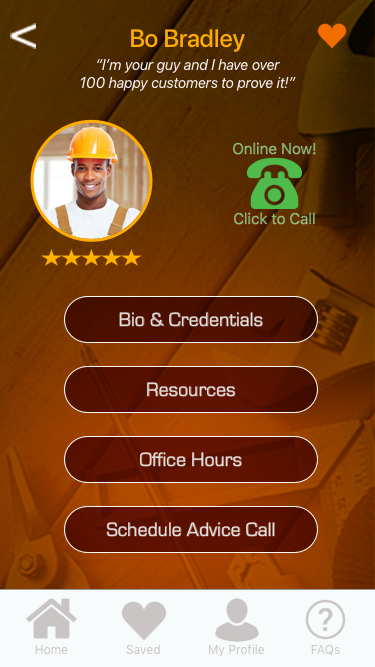
Documents button name to be changed to Resource Materials - Instead of finding supporting docs provided by the expert, testers thought it was a place
to find the expert’s license and insurance documentation.
Schedule Service button name to be changed to Schedule Advice call - Some testers thought this button would schedule an expert to come to their house.
Add page giving users direction after scheduling time with an expert - Testers were left wondering what happens after they schedule a call with an expert.
High Fidelity User Interface
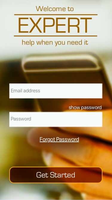
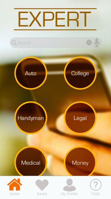
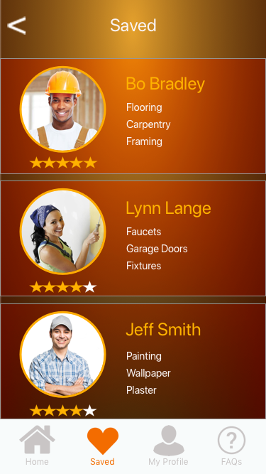
After analyzing the usability test results, another iteration was made, engaging emotional design principles.
The app is all about getting solid advice to help users do the work to solve their own problems. First impressions of EXPERT should give the user a feeling of trust. Using brown tones will evoke a feeling of reliability and practicality.

Design System
The final deliverable was handing off documentation to the development team.
Link to Prototype
https://invis.io/XMRGIMZNQD7
Browse the screens or execute the following scenario tasks to see how it works!
#1. You have just launched the app and want to learn how to use the app.
#2 Once you have have completed the onboarding, sign into an account you’ve already created with an email and password (assume email and password have been entered).
#3. You are looking for a handyman to fix the wood framing around one of your windows. You find a handyman who best suits your needs and want to see his profile.
#4. You like the handyman you found and want to schedule service with him on February 1, 2019 at 11:00am.
#5. You have confirmation of your appointment and now want to go back to the page where you can browse other categories.
Retrospective
For five months, I was the sole UX designer for the EXPERT app. With the guidance of a mentor, whom I treated like a client, I discovered, defined, developed, and delivered
every aspect of this project. Due to the nature of researching and developing this app over time, many changes and improvements have been made. These repeating
rounds of analysis and iterations have and will continue to create a better experience for the user- which is what User Experience Design is all about!
Liked
Build-Measure-Learn Cycle
The original concept of the EXPERT app was to provide instant expert help to users, any place and
any time. At no cost, users could contact an expert, ask a question, and have their problems solved.
After interviewing potential users and testing a prototype, the notion that free advice isn't always valuable.
Users would pay good money for solid guidance. A new feature "pay-as-you- go" spawned and then quickly
developed into a monthly service plan feature for unlimited advice.
Users stated they would be willing to pay a few hundred dollars per month for unlimited, reliable service.
There was also an interest for purchasing supporting documents provided by the expert.
Learned
New Software
As a former video editor and graphic designer, I have a lot of experience creating visual experiences.
Becoming more proficient with UX tools enabled me to better expedite tasks and hone skills needed as an experienced a UX designer.
Lacked
Time and Resources
It would have been great to have teams and time for more iterations. If the resources were available, it would have been great having agile UX teams to create a lean
product, from which we can build upon-- more of the build-measure-learn cycle.
Longed for
Having the chance to interview actual experts, define their needs as service providers, and develop the part of the app they would use and then test it.